Eight architectural projects, from the first image to a studio website.
This work has two parts. The first is image production: exteriors, interiors, rooms shown both empty and furnished, plans and 360° scenes for eight projects, ranging from a single garden house to a mixed-use city square. The second is the digital experience that presents them: HEC. Design, a bilingual architectural visualisation studio website where every project opens full screen and every interior can be compared empty and furnished.
Visit HEC. Design ↗- Role
- Visualisation, design and implementation
- Project
- Independent concept
- Images
- Exteriors, interiors, plans, 360° scenes
- Platform
- Responsive web, Turkish and English
- Tools
- Blender, AI-assisted image generation, Codex, Claude Code
- Delivery
- Published on Vercel
The starting point
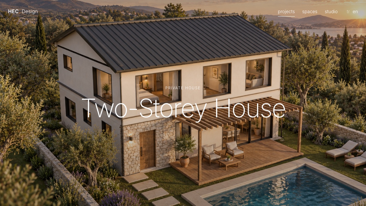
01The work began with one question: how can a building be experienced before it is built? The first project was a single-storey house with a garden. Over time the collection grew to include a two-storey house, an apartment building, a boutique shopping centre, two residential estates, a neighbourhood courtyard and a mixed-use city square.
It was clear from the outset that one striking image per project would not be enough. Visitors needed to see each building from the outside and the inside, compare its rooms before and after they are furnished, and stand at particular points to look around.
Producing the images
02I modelled the buildings in Blender and developed every image through successive review rounds, moving from schematic massing studies to the point where materials, light, shadow and landscape read convincingly. AI-assisted image generation supports that stage. The results are concept visualisations, not photographs of built projects.
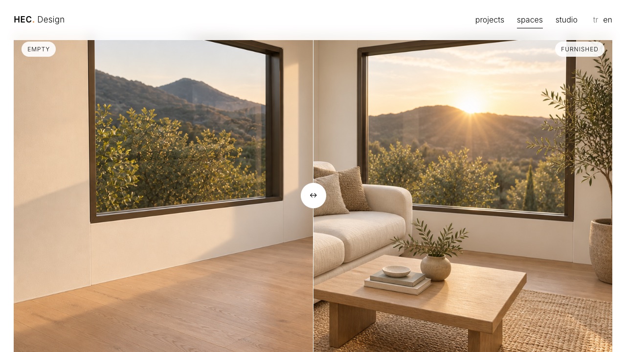
Every interior was produced twice from the same camera position: empty and furnished. The difference between the two therefore reads as the transformation of one room rather than as two separate pictures. The garden house and the apartment building are also documented with floor plans.
For the city-scale projects, eleven spherical renders at 8192 × 4096 let a visitor look around from a fixed stop and then move to the next. The two-storey house can be explored freely as a model. Naming these two formats accurately was part of the work: a fixed-point panorama is not a free walkthrough.
Rethinking the website
03The earlier version of the site presented the same projects through large headlines, scroll-driven scenes and a long home page on which each project appeared in three different places. It asked visitors to read at length before they reached the images.
The redesign rests on a single principle: the images come first. The reference was an interior architecture studio whose site presents every project as one full-screen image carrying only its name. The name and identity were renewed in the same process: the studio became HEC. Design, and the orange point in its wordmark is the only colour accent on the site.
Design decisions
04On the home page every project is a panel that fills the screen. As the visitor scrolls, each new panel slides over the previous one, leaving only the project's name and category at the centre. The visual language is built on black, white and a light weight of Inter, so that colour comes only from the images.
Navigation is reduced to three links — projects, spaces and studio — alongside a Turkish–English language switch. While the panels change, the contact details stay fixed in the bottom-left corner.
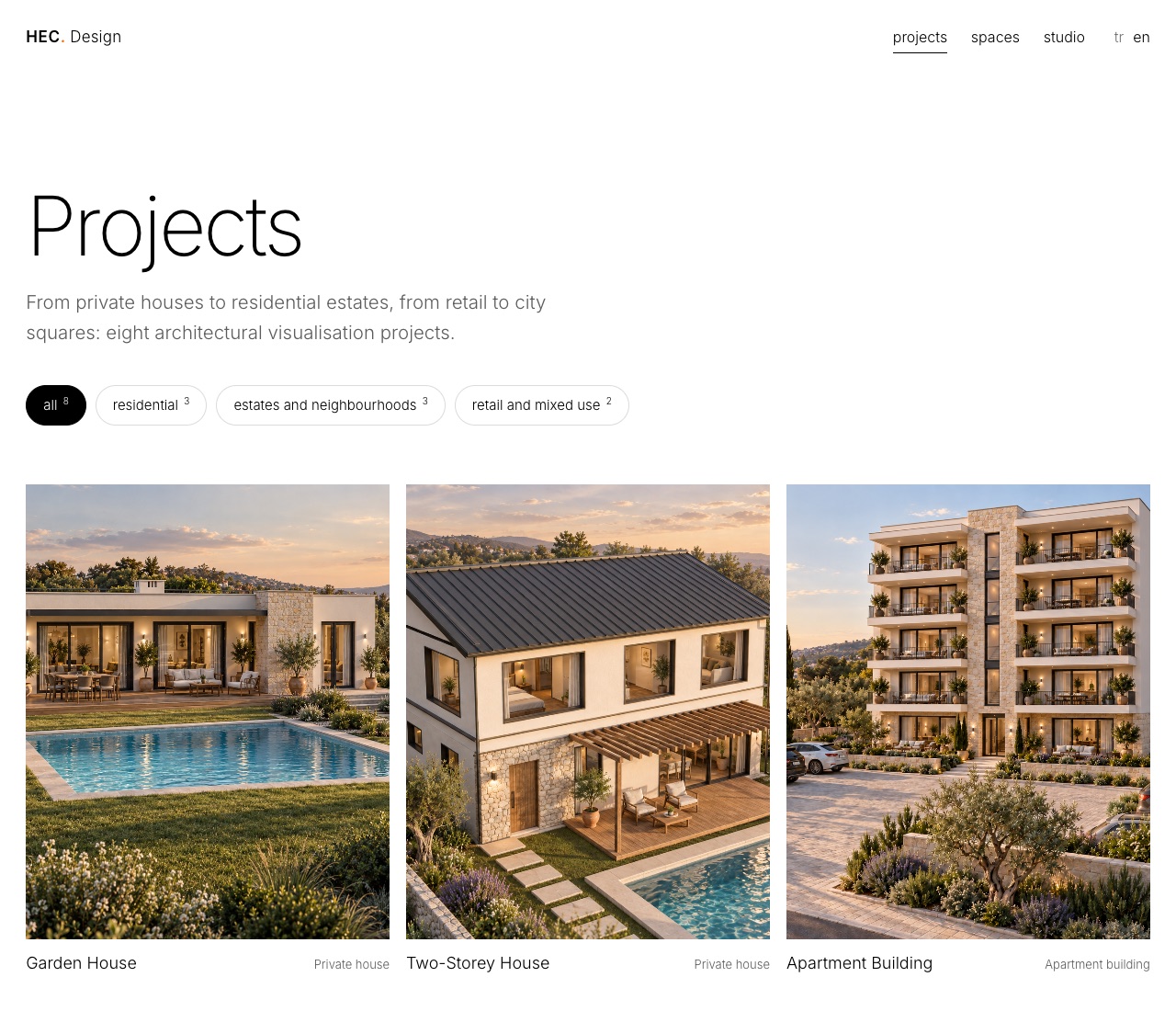
The projects page offers a three-column grid and three filters: residential, estates and neighbourhoods, retail and mixed use. Where a room exists both empty and furnished, the page turns the pair into a comparison slider automatically. Every page is generated in both languages from a single project file by a small build script, so the Turkish and English versions can never drift apart.
Rules set by the material
05Twenty-seven of the images are 360° panoramas. Cropped to fill the screen, their straight lines bent and the rooms looked different from what they are. Panoramas are therefore always shown whole, labelled 360°, and never used as a cover on any page.
The images are published at the quality they were produced in — not resized and not recompressed. To manage page weight, each image loads only as it approaches the screen. The opening title does not wait for its image and is readable from the first moment.
Outcome
06Sixty-nine images, four plans and their associated tours, across eight project pages, brought together in a twenty-four-page website in Turkish and English.
I checked the menu, the filters, the comparison slider, the language switch and horizontal overflow at desktop and phone widths. These are pre-release quality checks; the project makes no claim about visitor numbers or commercial results.
- 01
A full-screen opening
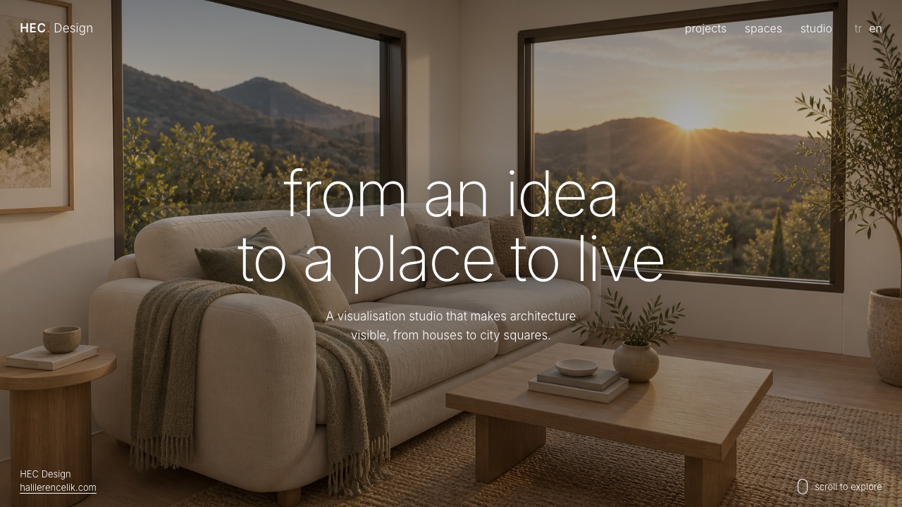
The home page opens with a single interior image and a short line that sums up the studio's position. The menu and contact details sit on top of the image, kept small enough not to compete with it. As the visitor scrolls, the eight projects follow as full-screen panels, each carrying only its name and category.
- 02
One room, empty and furnished
Each interior was produced twice with the same camera position, light and framing: empty and furnished. The comparison slider layers the two, so dragging the line reveals the room's architecture and its lived-in state within the same frame. The slider can also be operated from the keyboard.
- 03
The same experience on a phone
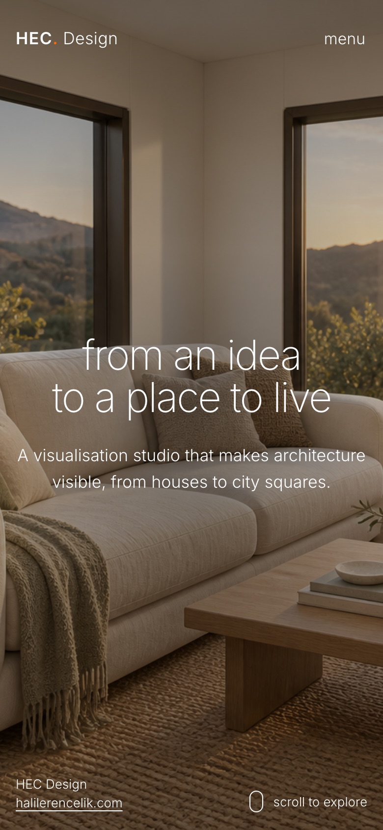
On a phone the panels keep the full height of the screen, while type and spacing are rescaled for the smaller display. The navigation collapses into a single menu link that opens as a full-screen layer. Contact details and the scroll cue stay fixed in the lower corners.
- 04
A filterable project collection
The projects page presents the eight works in a three-column grid. Filters for residential, estates and neighbourhoods, and retail and mixed use narrow the list without reloading the page; the chosen filter is written to the address, so a shared link opens on the same view.
- 05
Each project opens with its own cover
A project page begins with a full-screen cover and the project's name. It continues with a summary of category, scope and type of work; exterior and interior images; empty-and-furnished comparisons; floor plans where they exist; and links to the 360° tours. The page ends with a full-screen transition to the next project.
Explore the result.
All eight projects, with their images, comparisons and tours, can be explored on the live website in Turkish or English.
Visit HEC. Design ↗