Turning a product story into a demo people can actually use.
The product already had a working mobile app and an institution panel. The website needed to do more than display screenshots: it had to explain one connected system, make its social model understandable and let visitors try both sides of the product without leaving the story.
Visit the live product website ↗- Role
- Design direction and implementation
- Project
- Independent concept
- Platform
- Responsive web
- Content
- Product story and demos
- Tools
- Codex and web technologies
- Delivery
- Live with interactive demos
The communication problem
01The app covers reporting, evidence, open progress, community support, leadership and rewards. The institution panel adds triage, ownership, response times and user-confirmed resolution. Showing every feature at once produced a dense catalogue rather than a coherent explanation.
The website therefore needed a clear sequence: start with the problem, reveal the reporting loop around the phone, widen the story to physical and digital issues, then show how institutions act on the resulting signal.
My role
02I shaped the information architecture, visual direction, copy hierarchy and responsive behaviour, then built the site end to end with AI-assisted development. I reviewed each iteration in the browser and adjusted the experience from the first viewport through the live demos.
The work included the landing experience, scroll-linked mobile story, interactive application frame, working institution panel, responsive states and publication.
Decisions that shaped the experience
03The phone stays central while the story moves around it. Each scroll step introduces one job—report, prove, track, verify, support, lead and earn—so the interface and the explanation change together instead of competing for attention.
Black, warm white and signal yellow connect the website to the product UI. Large display type carries the narrative, while a low-opacity navigation texture gives the dark surfaces depth without reducing legibility.
The most important decision was to make the demos real. The phone and the institution panel are embedded working products, not decorative images. Visitors can scroll the feed, open reports, change sections and use panel controls directly.
Responsive behaviour
04Desktop uses the width to keep the phone fixed between supporting copy. On smaller screens, the same sequence becomes a vertical reading flow: the phone remains prominent, feature notes move beneath it and controls keep a usable touch target.
The institution panel keeps its wide working surface on desktop and becomes a contained tablet-like viewport on mobile. Headline measures, line breaks and spacing are adjusted at the breakpoint so the story remains readable rather than simply shrinking.
What shipped
05The result is a live product website that joins marketing and product experience in one page. It introduces the complete reporting loop, distinguishes physical and digital cases, explains community and trust mechanics, and provides usable mobile and institution-panel demos.
The site was checked at desktop, tablet and phone widths, including text wrapping, horizontal overflow, touch targets and live iframe behaviour. These are delivery checks; the project does not claim measured conversion or commercial impact.
- 01
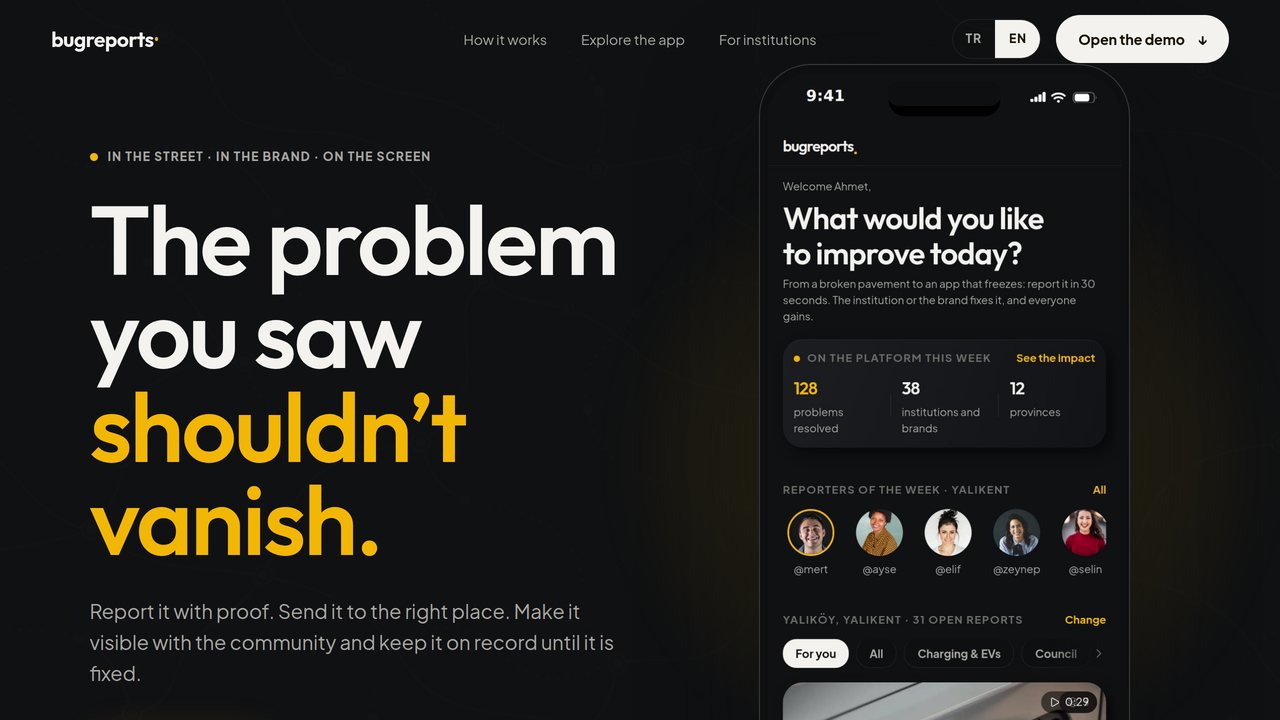
A product-first opening
The first viewport pairs one clear promise with the real application interface and keeps the phone visible inside the fold.
- 02
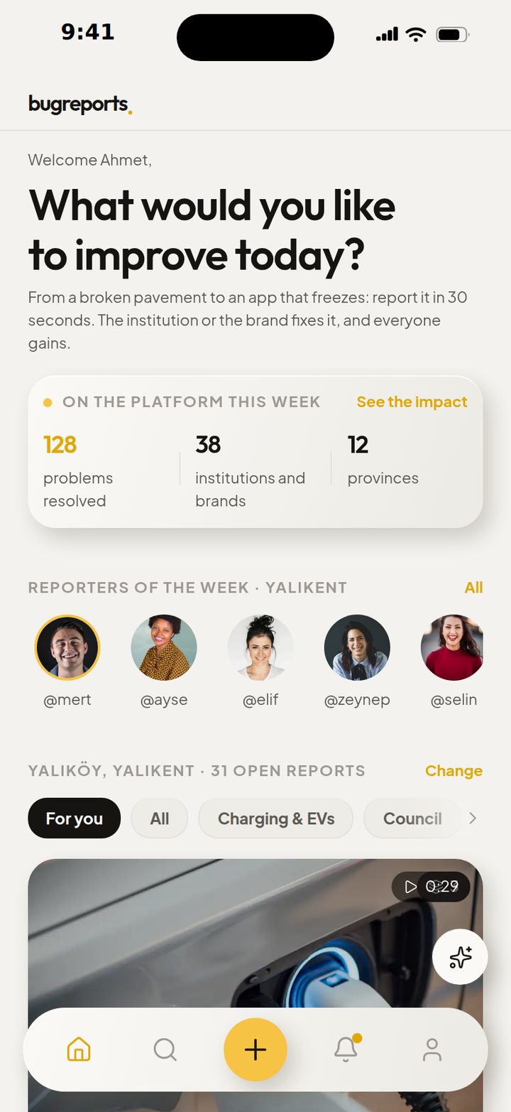
The application inside the story
The mobile experience is shown with the same high-resolution interface used by the live demo, not a blurred decorative mockup.
- 03
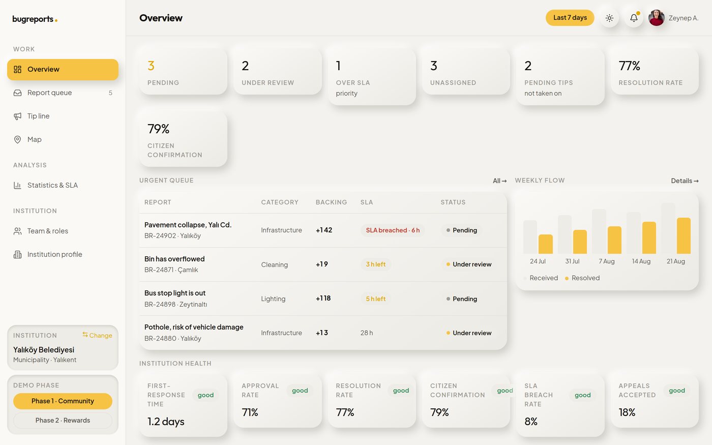
The institution side
A wide working panel turns reports into a prioritised queue with ownership, timing and resolution signals.
Try the result.
Follow the complete product story on the live website, then use the phone and institution panel directly inside the page.
Visit the live product website ↗