
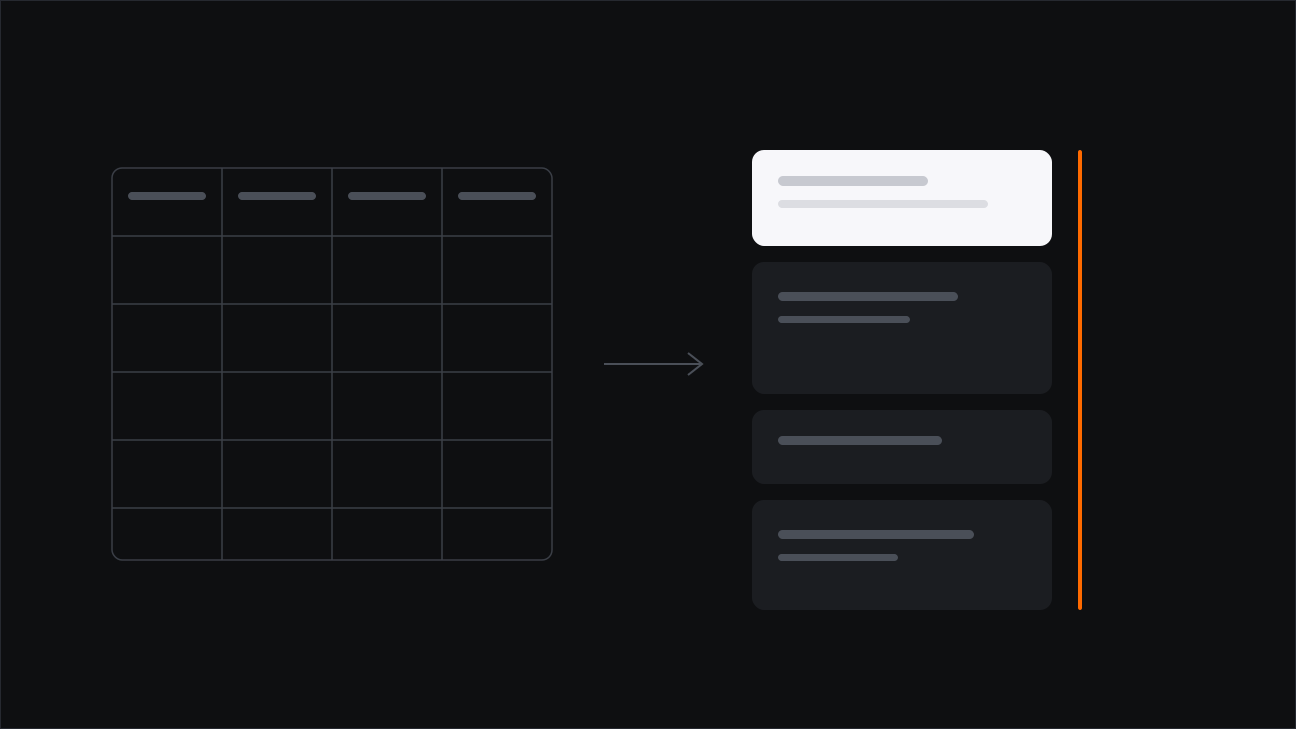
My television is YouTube. News, learning, sport, entertainment, and the hours that go nowhere in particular — the right subscriptions turned it into a channel lineup built for one person. I want to be precise about what happened there, because it was not a content victory. It was a product one.
Is this just my habit?
No, and the numbers are blunt about it. In April 2026, Nielsen measured YouTube at 13.4% of all television watch-time in the United States — not of streaming, of television. Netflix was second at 7.8%. YouTube is the most-watched single service on the American TV screen, ahead of any broadcaster or cable network.
The category moved with it: streaming took 47.6% of all TV viewing that month, more than cable and broadcast combined. And the detail that undoes the usual assumption — YouTube's growth on the television screen has outpaced its growth on phones. This is not a small-screen story that wandered into the living room. The living room is where it is winning.
Turkey has not flipped the same way, and I would rather say so than flatter my own habit. RTÜK's Medyametre survey, run with 15,766 people, still put daily television at 3 hours 43 minutes, with social media at 3 hours 12. My viewing is ahead of the national average, not typical of it. What I am describing is where the line is heading, seen from someone standing further along it.
What did television actually lose?
Television's product was never the programmes. Any channel could buy programmes. Its product was curation plus a schedule: somebody decided what was worth showing, and somebody else decided when, so that eight o'clock meant something.
YouTube took both halves. Subscriptions became the lineup — I assembled my own channels, one at a time, and they are better matched to me than any broadcaster could manage. And the recommender became the programming director: it decides the running order, what leads, what follows, what gets a second chance tomorrow.
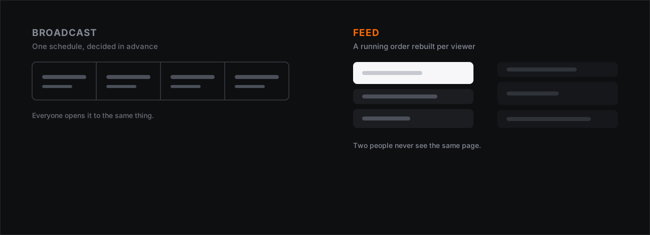
That second half is the part designers should look at hardest. A schedule is a public artefact — you could print it in a newspaper, argue with it, notice what it excluded. A feed cannot be printed. There is no shared copy to argue with, because no two people are looking at the same one.
People don't read. What did YouTube do with that?
There is a belief the whole discipline has been built on. In 1997 Jakob Nielsen asked how users read on the web and answered in two words: they don't. A decade later his group put a number on it — on an average page, a visitor has time for at most 28% of the words, and 20% is likelier.
Every designer has drawn the same conclusion from that finding: write less. Shorten the page. Summarise at the top. Cut the paragraph to a bullet. Users are impatient, especially on a phone, so give them less to get through.
YouTube drew the opposite conclusion, and it was the right one. People don't read — but they will happily watch for four hours. The problem was never the appetite. It was the medium.
Then it went further, and this is the part I find genuinely instructive. Having won the attention, it handed the viewer tools to spend less of it:
- Playback speed. Watch at 1.5× or 2×. The impatience the research found is not denied, it is equipped.
- AI summaries. Generated video summaries, first tested on English videos, have rolled out globally — a glance at what a video contains before committing to it.
- The Ask tool, sitting on the video itself. You are on a forty-minute talk. Instead of playing it, you open Ask underneath the player and type summarise this video — and you get it, in the same screen, without the video ever starting. You can keep going: what did they say about pricing, quiz me on this, what is the argument in the last section. It is available to any signed-in viewer over 13, in 37 languages, on phones, web, TVs and consoles, and it does not require Premium. Its sibling, the conversational Ask YouTube search, is much narrower — US Premium subscribers, opt-in — and the two are easy to confuse.
Look at what that adds up to. A product that holds attention better than anything else on my devices also ships the fastest available ways to consume less of it.
That is not generosity, and reading it as generosity is the mistake. Speed controls and summaries remove the last honest reason to leave — this is too long, I do not have time. The product answers: then have it shorter. You still have it here.
My subscriptions, or the algorithm?
Here is the wrinkle I keep catching myself on. I describe the feed as personalised by me — my subscriptions, my choices, a channel lineup I curated. That is how it feels. But it is not quite what is happening.
I chose the channels. I did not choose the order, the thumbnails, which upload surfaces today and which one quietly does not, or the video that plays when the one I picked ends. The part I authored is the ingredient list. The part that decides the meal is somewhere else.
Neither half is sinister on its own. Together they produce something worth naming: a system that feels chosen while doing most of the choosing. That gap between the felt experience and the actual mechanism is a design outcome, not an accident, and it is the most transferable thing in this whole post.
A product that feels chosen while doing most of the choosing is not a neutral one. It has simply hidden its opinions well.
Then there is my screen time
I will put this plainly, because leaving it out would make the rest less honest: my YouTube screen time is high enough to beat what most people would call phone addiction. That is not a boast and it is not a confession. It is a measurement, and I find it the most useful thing I know about the product.
I design interfaces intended to hold attention. Retention, engagement, session length — these are things I am asked to improve, and improving them is considered good work. So it is worth sitting with the fact that a system built by people doing my job, better resourced than me, holds my attention more completely than anything else on my devices.
Knowing how a mechanism works does not exempt you from it. If anything it should make you more careful about building the next one.
What does a designer take from this?
Three things, and none of them is "recommendation engines are bad".
- Curation and recommendation are different products. One gives the user authorship, the other gives them results. Most feeds blur the two and let the user believe they are getting the first. Being clear about which you are shipping is a design decision, and usually an unmade one.
- Personalisation removes the shared copy. When every viewer sees a different page, nobody can point at it and disagree. Whatever you think of that, it is a property of the product, and it deserves to be chosen deliberately rather than inherited from the pattern.
- Engagement is not a neutral metric. It measures how well the product held someone. Whether that was worth their evening is a separate question, and the metric will never ask it for you.
- "Users are impatient" does not have to mean "make less". It can mean make more and hand over the controls to compress it. That is the more commercially useful reading, and it is worth noticing which of the two your roadmap has quietly assumed.
Television lost because someone built a better product. That is the whole story, and it is not a comfortable one for the people building the next better product — which is us.
Read next